Plotting
Every standard plot is a method on the object that owns the data. Each one
accepts ax= to draw onto an existing axis, applies the packaged
lazuli.mplstyle through a context manager so that your own matplotlib
settings are left alone, and returns (fig, ax). The figures on this page
are produced at build time from the code shown above them, for the default
simulation:
from esc_etc import Simulation

sim = Simulation.from_default(hoststarmag=-0.353, planetdeltamag=20,
                              contrast=1e-8, ppgain=10, separation=0.4)
The methods
Method |
What it plots |
|---|---|
|
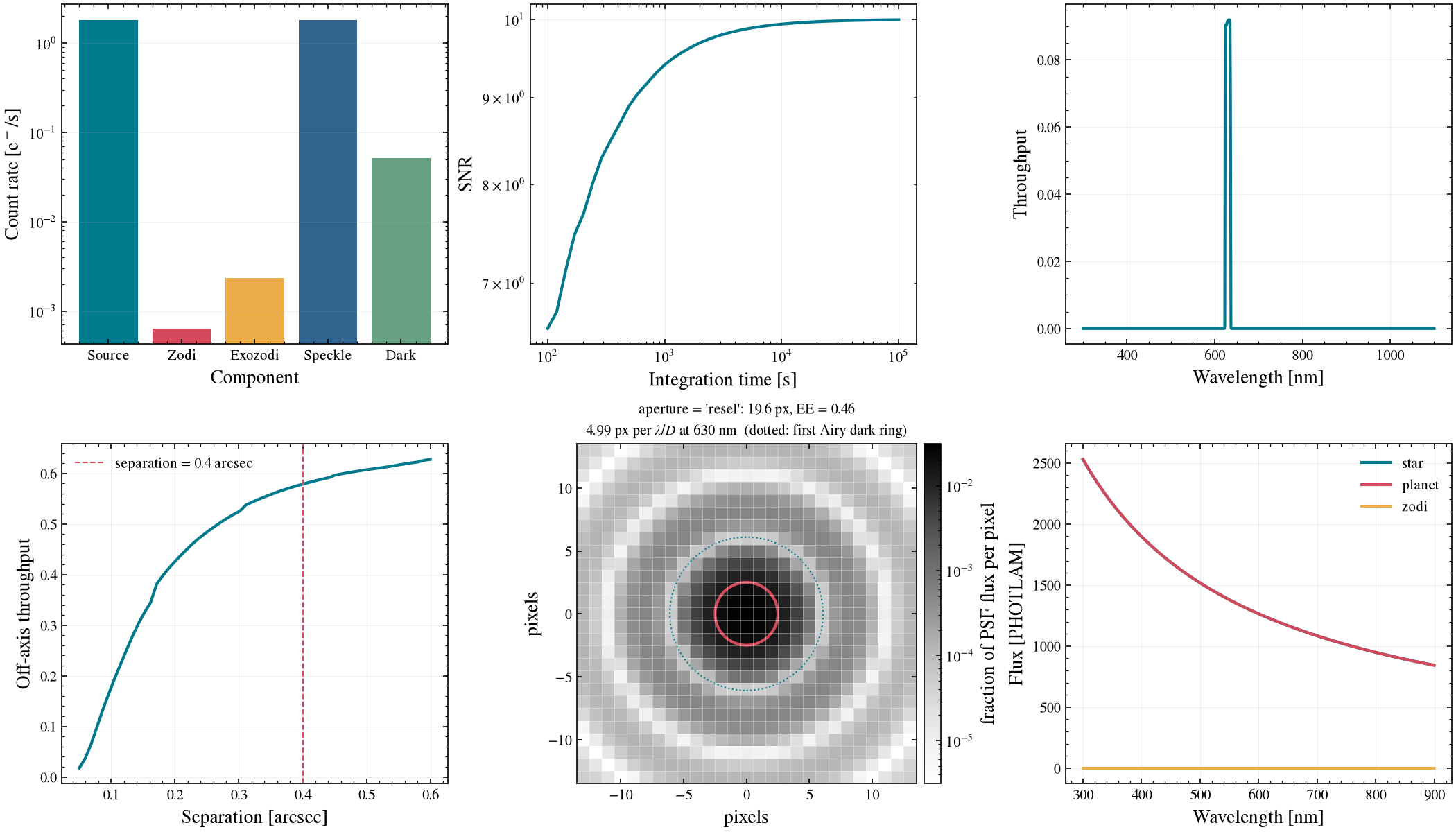
A 2 x 3 overview of the six panels that follow. Returns
|
|
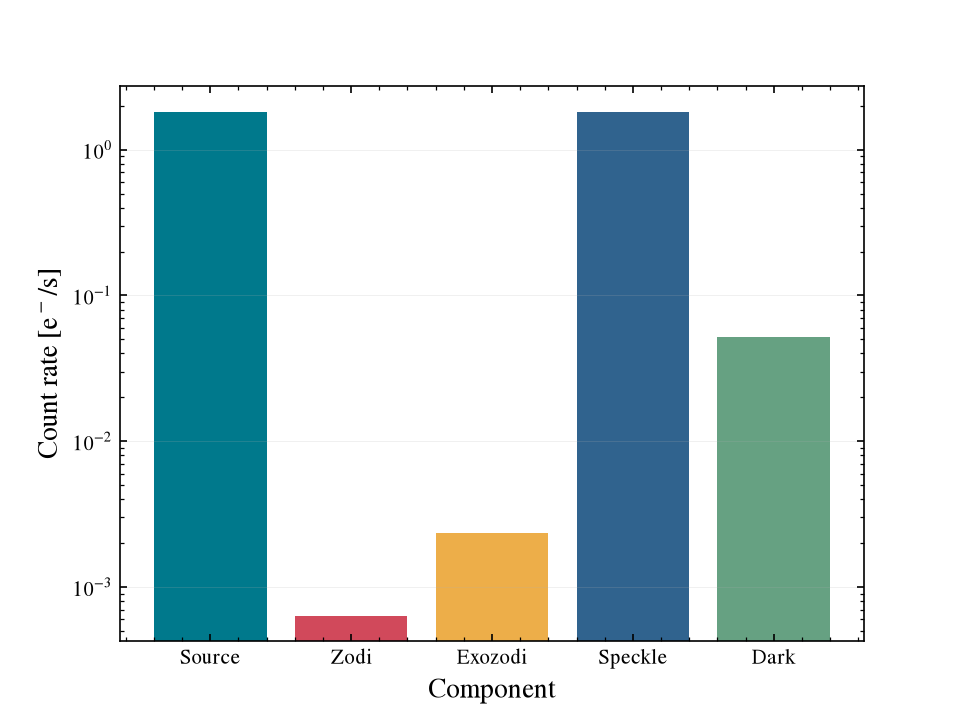
Bar chart of the count-rate contributors (planet, zodi, exozodi, speckle, dark current). |
|
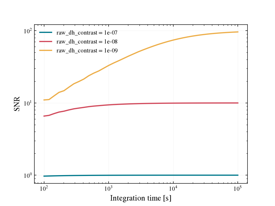
SNR as a function of integration time; see the sweeps below. |
|
The sensor’s optical bandpass (throughput against wavelength). |
|
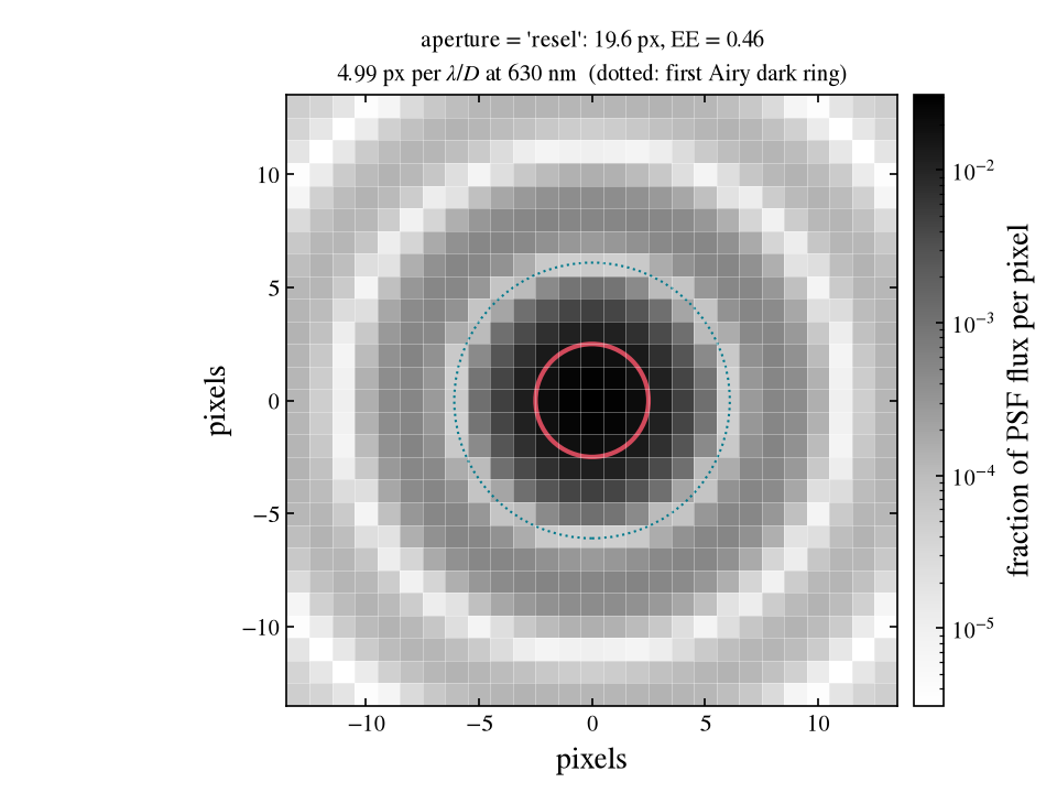
The photometric aperture drawn over a pixel-integrated Airy PSF. |
|
Focal-plane mask throughput against separation, with the current separation marked. |
|
The scene-element spectra (star, planet and zodi by default). |
The overview
fig, axes = sim.plot()
Single panels
Each panel is its own method. The count-rate budget and the aperture footprint:
fig, ax = sim.plot_count_rates()
fig, ax = sim.sensor.plot_aperture()
Parameter sweeps
plot_snr_vs_time takes sweep=, a one-entry dictionary naming any
parameter you could pass to update() and the values
to try. One curve is drawn per value and the original value is put back:
fig, ax = sim.plot_snr_vs_time(sweep={"coronagraph__raw_dh_contrast": [1e-7, 1e-8, 1e-9]})
The same works for any other parameter, for example
sweep={"coronagraph__ppgain": [5, 10, 20, 50]} or
sweep={"scene__zodi__mag": [22.5, 20]}.
Several curves on one axis
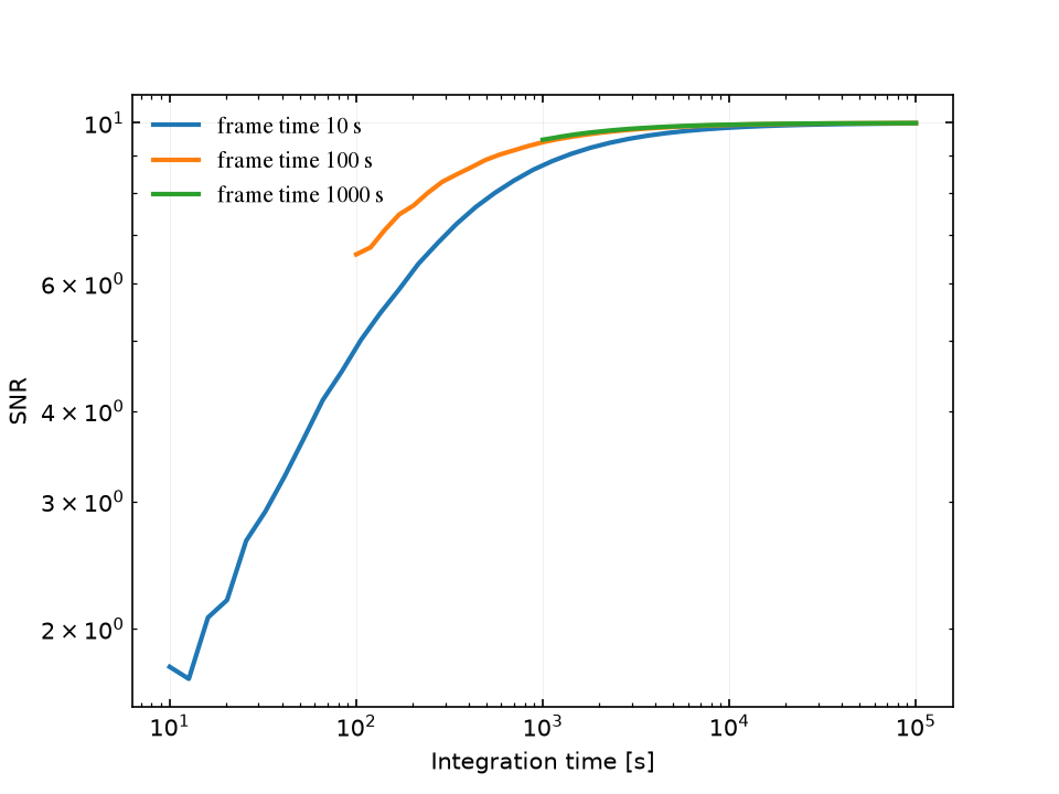
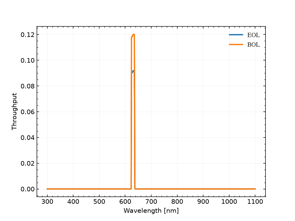
plot_snr_vs_time, plot_bandpass and plot_offaxis_throughput take
label=; with ax= that gives a legend without touching the lines:
import matplotlib.pyplot as plt

fig, ax = plt.subplots()
for ft in [10, 100, 1000]:
    sim.plot_snr_vs_time(frame_time=ft, ax=ax, label=f"frame time {ft} s")
fig, ax = plt.subplots()
Simulation.from_default(filter="F630N", lifetime="eol").plot_bandpass(ax=ax, label="EOL")
Simulation.from_default(filter="F630N", lifetime="bol").plot_bandpass(ax=ax, label="BOL")
The functions behind the methods
The methods call the functions in esc_etc.plotting, which also accept
raw arrays instead of a simulation (rates with a sensor,
total_times with snrs, wavelength with throughput, and so
on). See the Plotting (esc_etc.plotting) reference for the signatures.
Tip
When generating many figures in a loop, close the ones you do not keep
with plt.close(fig) to avoid accumulating open figures.
The house style
The same style is available for your own plots:
from esc_etc import lazuli_style, use_lazuli_style

use_lazuli_style()             # apply globally to the current session

with lazuli_style():           # or scope it to a block
    ...                        # your plotting code
The exported colour tokens TEAL, RED, AMBER, BLUE, GREEN,
DARKBLUE and the LAZULI_COLORS sequence are the palette the methods
use.