Plotting
The wcc_etc.plotting module has ready-made diagnostic plots in
matplotlib and bokeh, plus a shared house style. The image and profile
functions come in a *_mpl and a *_bokeh variant. The curves a
Simulation computes have plot methods of their own, listed
further down.
The house style
Apply the shared theme once per session or notebook:
import wcc_etc
wcc_etc.set_wcc_style()        # global matplotlib rcParams
wcc_etc.WCC_STYLE              # the underlying rcParams dict
The style uses STIX math and text fonts, 150 dpi, inward ticks, and faint gridlines on 1-D plots (image plots turn the grid off).
The example image
The examples below reuse the same simulated image, a G5V star on the zodiacal
background through sony:r:
import matplotlib.pyplot as plt
import numpy as np
import wcc_etc
from wcc_etc import (
    get_scene, ImageSimulator, Sensor, Simulation, AiryPSF, DefocusPSF,
    DEFOCUS_2WAVE_PATH, plot_image_mpl, plot_image_row_mpl, plot_radial_mpl,
    plot_encircled_energy_mpl, plot_bandpass_mpl,
)

wcc_etc.set_wcc_style()

scene = get_scene("G5V", mag=12, background="zodi", bandpass="johnson_r")
imsim = ImageSimulator.from_sensor_and_scene("sony:r", scene, npix=200)
img = imsim.simulate(time=30, psf=AiryPSF(), add_noise=True, seed=0)

# a much brighter star, to show the saturation overlay
bright_scene = get_scene("G5V", mag=7, background="zodi", bandpass="johnson_r")
bright_imsim = ImageSimulator.from_sensor_and_scene("sony:r", bright_scene, npix=200)
bright_img = bright_imsim.simulate(time=30, psf=AiryPSF(), add_noise=True, seed=0)
The image plots
Function pair |
What it shows |
|---|---|
|
A single image with equal x/y scale, a |
|
A three-panel row: PSF plus noise, PSF without noise, saturation mask, on a shared color scale. |
|
The azimuthally averaged radial profile with a half-width marker. |
|
The encircled-energy curve (normalized to 1) with an optional
|
|
A filter throughput curve, from a synphot |
A single image
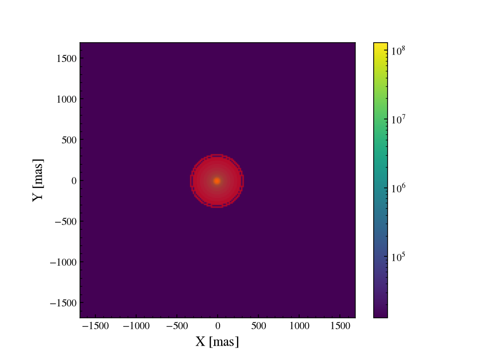
show_saturation=True overlays the saturated pixels in red, and units=
labels the axes in "pix", "mas" or "arcsec". stretch="log"
gives a log colour scale whose floor sits dyn_range (default 1e4) below
the peak, which is the usual way to see the wings of a PSF. The bright star
below drives the core well past the Sony full well:
plot_image_mpl(bright_img, show_saturation=True, units="mas")
A three-panel row
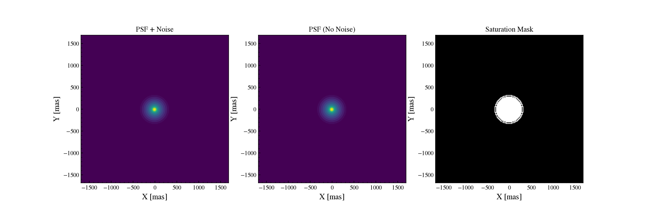
plot_image_row_mpl puts PSF plus noise, the noiseless PSF, and the
saturation mask side by side on a shared color scale, which is the quickest
way to see what the noise is doing to a given exposure:
plot_image_row_mpl(bright_img, units="mas")
The radial profile
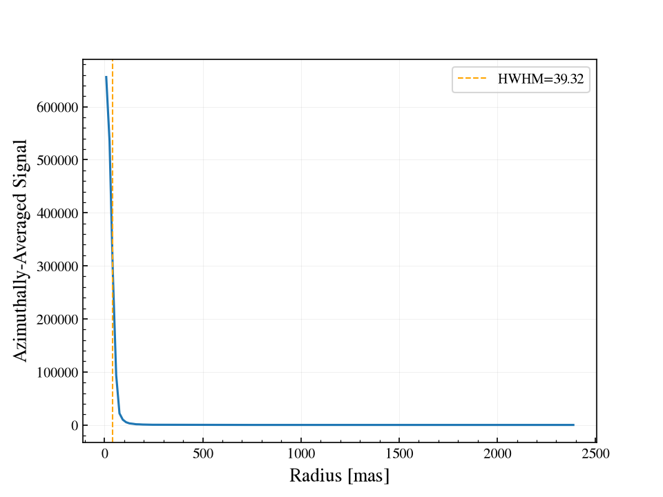
plot_radial_mpl(img, units="mas")
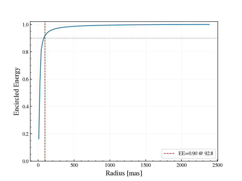
Encircled energy
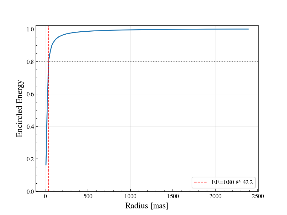
ee_target= marks the radius enclosing a given fraction of the flux, which
is the aperture the SNR machinery is choosing between:
plot_encircled_energy_mpl(img, units="mas", ee_target=0.8)
Two ways to call them
Each function accepts either a SimulatedImage as the first
positional argument, or raw arrays via keywords (image_e=,
image_clean=, saturation_mask=, pixel_scale_mas=).
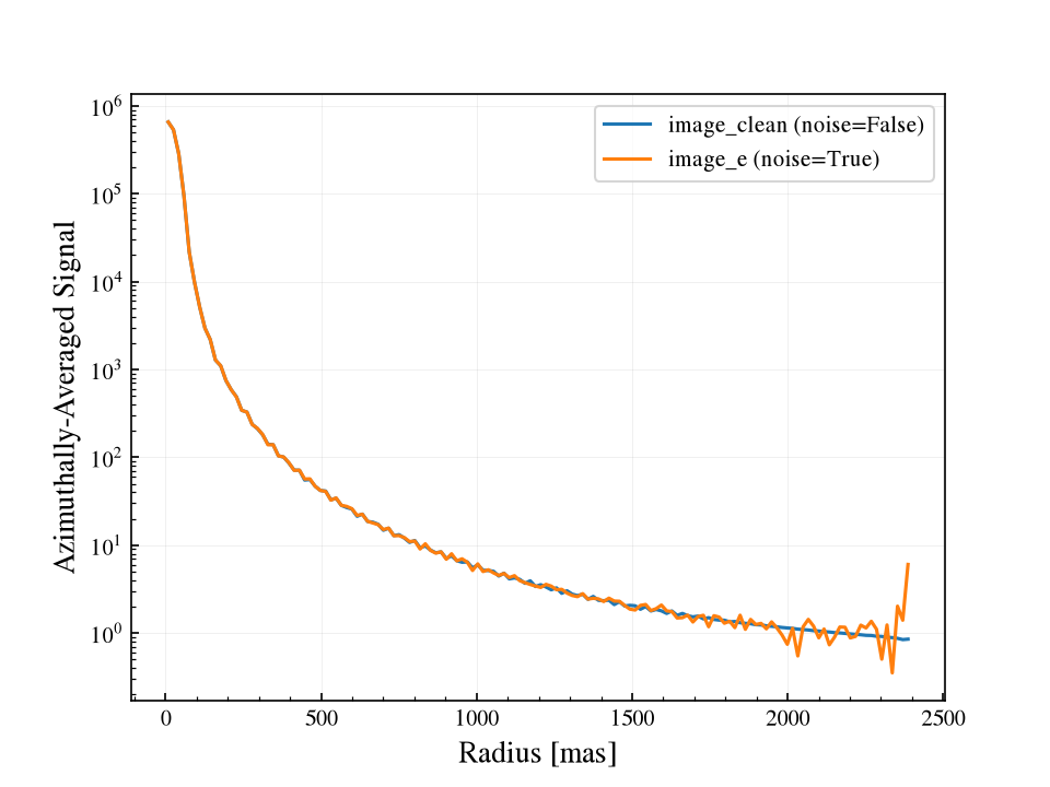
Mind which array each helper reads. The 1-D helpers default to
noise=False and so profile image_clean, so that is the array to
supply; pass noise=True to profile the noisy image_e instead. The two
track each other through the core, where the signal is strong, and the noisy
profile scatters about the clean one further out as the per-annulus counts
fall towards the background:
# Raw arrays rather than a SimulatedImage, both branches on one axis.
fig, ax = plt.subplots()
plot_radial_mpl(
    image_clean=img.image_clean,
    pixel_scale_mas=img.pixel_scale_mas,
    units="mas",
    ax=ax,
    show_hwhm=False,
    label="image_clean (noise=False)",
)
plot_radial_mpl(
    image_e=img.image_e,
    pixel_scale_mas=img.pixel_scale_mas,
    units="mas",
    noise=True,
    ax=ax,
    show_hwhm=False,
    label="image_e (noise=True)",
)
ax.set_yscale("log")
ax.legend()
Convenience methods on SimulatedImage
The image object dispatches to the functions above, with a backend=
switch:
img.plot_image(backend="mpl", show_saturation=True)   # also img.plot(...)
img.plot_image_row()                       # the 3-panel row
img.plot_radial(units="mas")
img.plot_encircled_energy(units="mas", ee_target=0.8)
img.plot_encircled_energy(units="mas", ee_target=0.9)
Return values and embedding
The matplotlib variants return (fig, ax), plus the (x, y) data for the
1-D plots, so you can pass an existing ax= and compose figures. The bokeh
variants take return_="obj" | "html" | "components": use "obj" for
bokeh.io.show() in a notebook, or "components" to get
(script, div) for embedding in the Flask web portal.
# bokeh: components for a web template
script, div = img.plot_image(backend="bokeh", return_="components")
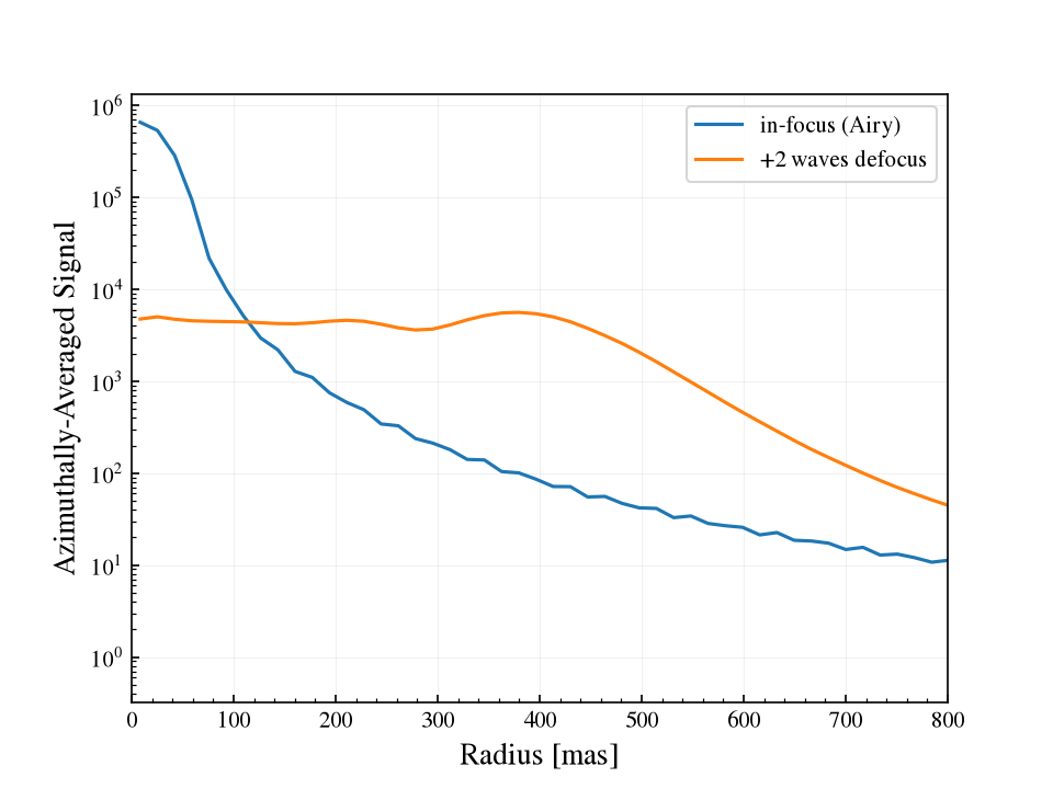
plot_radial_mpl, plot_encircled_energy_mpl and plot_bandpass_mpl
forward label= and any other extra keyword arguments to ax.plot,
which is what makes a labelled overlay legible. Here an in-focus Airy PSF is
drawn against two waves of defocus. The helpers also hand back the
(r, prof) they plotted, if you would rather draw it yourself.
clean_airy = imsim.simulate(time=30, psf=AiryPSF(), add_noise=False)
clean_defocus = imsim.simulate(
    time=30, psf=DefocusPSF(DEFOCUS_2WAVE_PATH), add_noise=False
)

fig, ax = plt.subplots()
plot_radial_mpl(
    clean_airy, units="mas", ax=ax, show_hwhm=False, label="in-focus (Airy)"
)
plot_radial_mpl(
    clean_defocus, units="mas", ax=ax, show_hwhm=False,
    label="+2 waves defocus",
)
ax.set_yscale("log")
ax.set_xlim(0, 800)
ax.legend()
Filter throughput
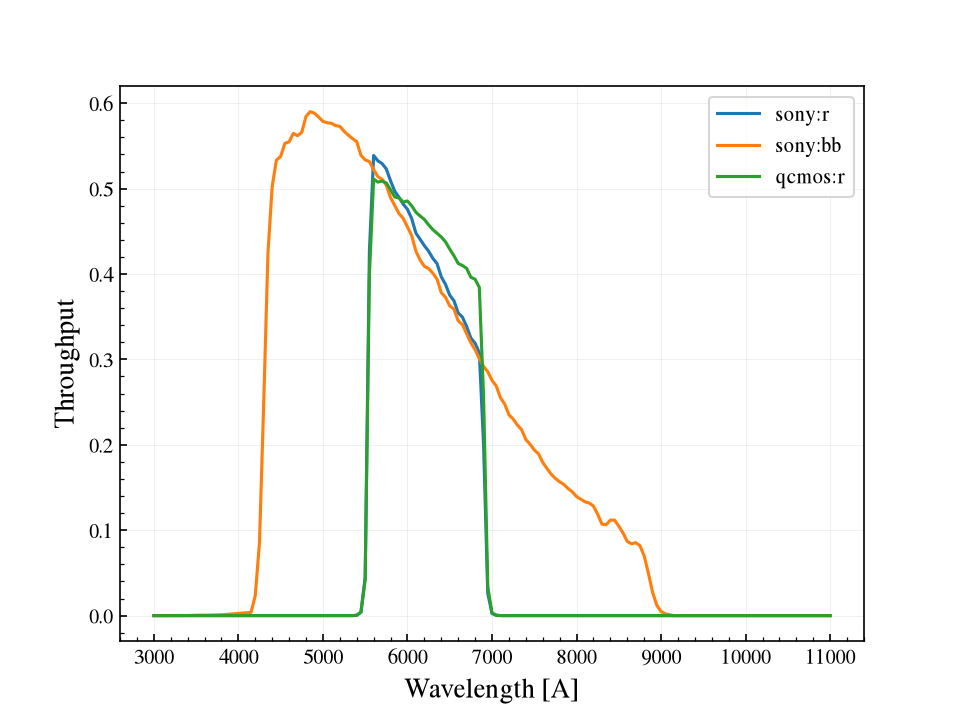
plot_bandpass_mpl draws a filter curve from a synphot SpectralElement
or from anything carrying one, so a Sensor can be passed
directly. Overlaying the sensors shows what each kind:band selects:
fig, ax = plt.subplots()
for label in ("sony:r", "sony:bb", "qcmos:r"):
    plot_bandpass_mpl(Sensor.from_config(label), ax=ax, label=label)
ax.legend()
Curves from a Simulation
Each of these takes the grid to evaluate on, an optional ax=, and extra
keywords for ax.plot (label= triggers a legend), and returns
(fig, ax). They accept the same psf= and n_reads= as the getters
they wrap.
Method |
What it draws |
|---|---|
|
SNR against exposure time, from |
|
SNR against source magnitude off one cached render
( |
|
SNR against any |
|
Peak pixel against time on log axes, with the |
|
Exposure time needed for each target SNR. |
|
SNR against aperture radius; a square marks the default aperture, a
circle the |
|
The bare normalized PSF from |
Overlaying several simulations is one loop:
sim = Simulation.from_sensor_and_scene("sony:r", scene)
texp = np.logspace(-1, 3, 200)
fig, ax = plt.subplots()
for mag in (12, 15, 18):
    sim.update(source__mag=mag)
    sim.plot_peak_pixel(texp, ax=ax, label=f"r = {mag}")
sim.update(source__mag=12)
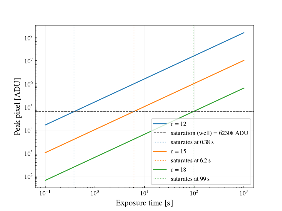
The Signal-to-noise and exposure time, Saturation and Scenes, sources, and backgrounds pages each use one of these to make their point.
Objects that plot themselves
A scene element and a sensor each draw themselves onto a supplied axis, which
is the quickest check that the scene and filter are the ones you intended.
Each also answers to .plot:
scene = get_scene("G5V", mag=12, background="zodi", bandpass="johnson_r")
sim = Simulation.from_sensor_and_scene("sony:r", scene)

fig, (ax_src, ax_filt) = plt.subplots(1, 2, figsize=(11, 4))

# the source spectrum, on your own grid and in your own flux unit
sim.scene.source.show(
    ax=ax_src, wave=np.arange(3500, 9500, 5.0), flux_unit="flam"
)

# the sensor's filter throughput
sim.sensor.show(ax=ax_filt, label="sony:r")
ax_filt.legend()
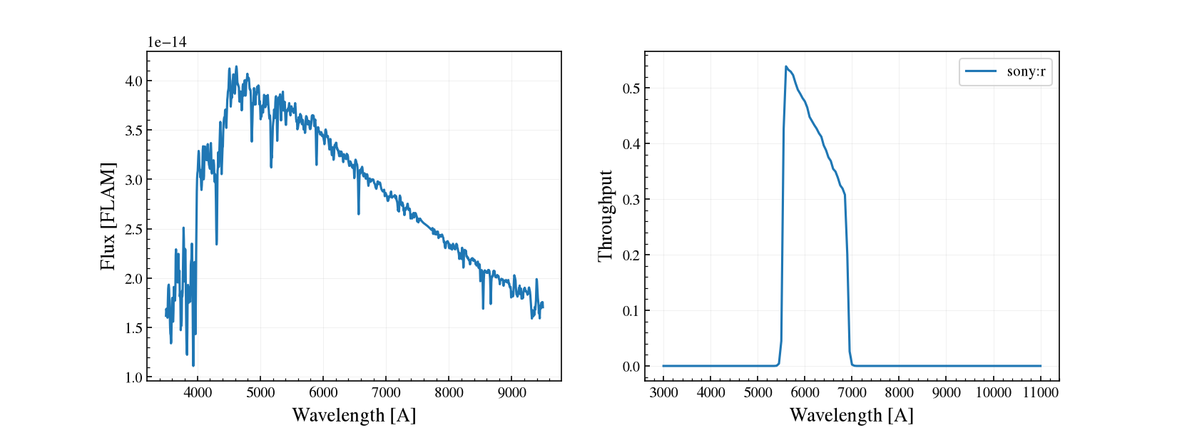
show() takes wave= (an explicit
wavelength grid; the default is the spectrum’s native waveset, which can run
far past the optical) and flux_unit= ('flam' for erg/s/cm²/Å,
'fnu'; the default is synphot’s PHOTLAM). show()
is a thin wrapper over plot_bandpass_mpl. Both forward extra keyword
arguments to ax.plot and return (fig, ax).